Accessibility: Blindness and Low Vision
- Megan
- May 12, 2021
- 6 min read
Accessibility and inclusion has been a hot topic in the knitting and crochet world recently, but accessibility itself is a very broad domain. A pattern might be accessible in that it comes in a wide size range, but not be accessible to makers who are blind or have low vision, or for makers with a low budget for yarn. Therefore, it doesn't make sense to label a pattern, or even a website, accessible. The question is, who is it accessible to? In this blog post, I will be discussing things to consider when formatting a pattern for the blind or visually impaired, although much of this information can also be applied to websites and social media (such as your Instagram posts and stories). This is a complex topic, so please consider this post an introduction rather than a comprehensive study, and do read through some of the resources shared at the end of the post for more detailed information. This post is written for an intended audience of designers, with an focus on considering how to make your patterns more accessible to makers with low vision or blindness, but anyone can use these ideas and guidelines to make their online presence more accessible.

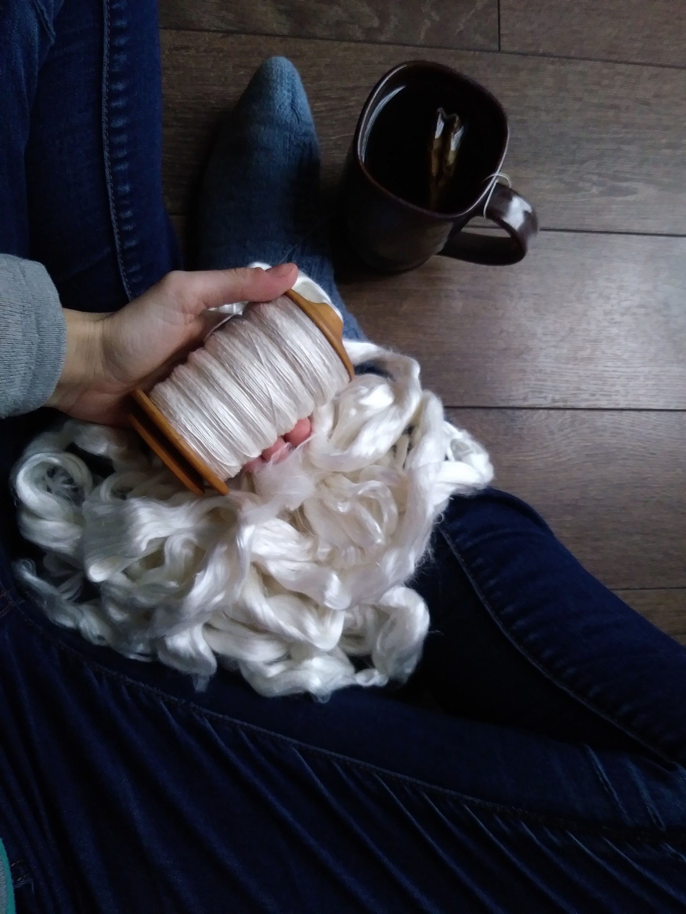
[Image description: A photograph of a large ceramic mug, a wooden spinning bobbin partially filled with singles, and a pile of unspun fibre. The scene is backlit in diffuse light, such that the colour of the mug is not clear, though the fibre and the singles are white.]
Many blind or low vision folks will use a screen reader, which means that they can only access patterns (and web pages!) that are properly formatted for screen readers. The best way to test this is to download a screen reader program (or use an inbuilt program on your device if you have one) and try your pattern with it to see how functional it is. Screen readers tend to have trouble with tables, and with abbreviations, which can make something like a typical stitch directory a nightmare for a visually impaired user! For an accessible pattern, it is best to avoid these and simply write everything out completely. The following examples are pulled from an article about Creating Accessible Documents in Microsoft Word, but each of these can be adapted depending on the program you are working with. When using headings and lists, it is important to use the actual functions within your word processing software, rather than simply bolding and increasing the font size, or using dashes. This is because the screen reader will be able to recognize a heading or list based on the formatting within the document, not just the appearance of the text. Another helpful strategy is to use meaningful hyperlinks, as I have done throughout this blog post. This means attaching the hyperlink to a phrase that describes where the link is going, rather than to single word like "here" or "this." That way when tabbing through the links, it is clear which link is going where.
It is important to offer different ways of accessing the same information, so that people with different barriers can access it. For example, it is preferable to offer both charts and written out instructions. Charts are relatively language free, and thus are accessible to folks who may not be proficient in English (not to mention those who can better understand a stitch pattern visually). Written out instructions are more accessible to people who are blind or have low vision, especially those who depend on screen readers, with the caveat that stitch abbreviations are often poorly rendered by screen reading software. Another point to consider is the difference between alt text and an in-text image description. Here is a great article that goes over the difference between alt text, image descriptions, and captions, and why it is important to include both alt text and image descriptions. This is helpful for me to read, because I have been using the same text for my alt text and image descriptions, so I will be doing things differently going forward. I also like this article about what to include in alt text and image descriptions.
Other items to consider are font, size, and colour/contrast. The Macular Society gives some guidelines on preparing documents for visually impaired people that suggest to use font sizes larger than 16, and avoiding blocks of capital letters, underlined, or italicized text as these can be difficult to read. Although there is no formal research available on what types of fonts are easiest for low vision readers, there does seem to be a consensus that sans serif style fonts are best, in particular fonts like Arial or Verdana. It is important to avoid stylized fonts, and look for ones where each letter is distinctive. With regards to colour and contrast, be careful not to use colour as the only means of distinguishing items (for example, in charts, add different shapes or symbols in addition to colour, to allow colourblind individuals to be able to use your document). It is helpful to view a greyscale version of the document in order to pick up on low contrast areas - low contrast is incredibly difficult for people with low vision to distinguish.
It may be overwhelming to imagine incorporating all of these guidelines into a pattern that is formatted in a way that is print friendly and aesthetically pleasing. One suggestion to manage these sometimes conflicting priorities is to provide a version of your pattern that is specifically formatted for low vision makers in addition to your typical offering, which will allow you to create a version that aligns with your historical patterns as well as a version with large font and no abbreviations, etc., that will be more accessible. If you are committed to offering patterns that are accessible to people who are blind or have low vision, you should consider having your business/patterns listed at the Accessible Patterns Index, which is a resource for folks who need accessible patterns.
If you are interested in digging deeper, or if you have your own website and are hoping to make it as accessible as possible, I suggest taking some time to review the Web Content Accessibility Guidelines, which is a compendium of guidelines developed by individuals and organizations around the world, with the intent of creating an industry standard for how to format accessible web content. Although these guidelines refer specifically to web content, rather than documents that may be consumed digitally or printed out, they do give an organized and detailed outline of what types of things should be considered when aiming for accessible content, which is helpful for those of us who may not even know where to start. I recommend starting with the How to Meet WCAG Quick Reference Checklist, or you can consider running your website through the WAVE Report (webaim.org), which will identify any accessibility issues present. I have done this for my own website in the lead up to publishing this article, and have identified a few issues that I will need to resolve.
There is no such thing as a perfectly accessible product. All we can do is educate ourselves about the accessibility standards that are out there, and work to meeting them at a bare minimum. We also need to make an effort to seek out marginalized communities and listen to them about their needs, and what changes they wish to see to improve accessibility. I have included a list of all of the sources I cited in this post, as well as others than I did not directly cite, but have found helpful.
References and Resources:
Social Media Resources:
Access Guide (@access_guide_) • Instagram photos and videos (info about how these standards can be put into practice)
Friday (@stitchedinthemiddle) • Instagram photos and videos (see highlight about UI/UX and accessibility)
Cathleen Fry (@cefry42) • Instagram photos and videos (created a survey re: impacts of NuRav)
Episode 2 : Accessibility in the Community - YouTube (Knitboop video includes info about NuRav and the impacts and response)


Comments